

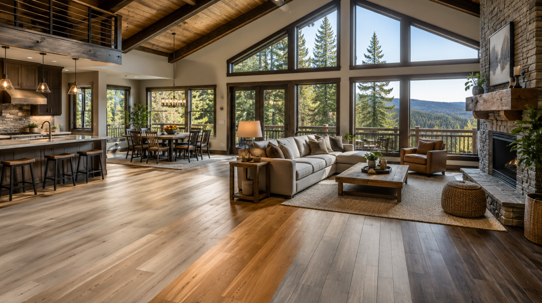
Finding the Right Color for a Nevada City Mountain Home
A flooring sample can look beautiful on its own, but the real question is how it will feel inside your home. Will it work beside pine walls, exposed ceiling beams, a stone fireplace, dark furniture, or large windows that bring the surrounding forest into view?
In a mountain home, flooring does more than cover the surface underfoot. It sets the visual foundation for the entire room. The right laminate color can make a space feel brighter, warmer, more open, or more grounded. It can also help connect the interior with Nevada City’s natural surroundings without making the home feel overly themed.
For many local homes, the most dependable color families are warm natural oak, honey and golden wood tones, greige and mushroom, smoked brown and chestnut, and sand or pale natural wood. Each creates a different atmosphere, and each works best with certain types of light, furniture, and architectural details.
There is no single best color for every property. A light-filled contemporary home may look great with pale sand tones, while a cabin-inspired living room may benefit from the depth of smoked brown. A vacation home used throughout the year may need a versatile mid-tone that feels welcoming in every season.
At Premier Flooring Center, Nevada County homeowners can compare natural-looking flooring colors with guidance from an experienced, employee-owned team. Looking at several samples side by side can make the choice much clearer, especially when you consider the room as a whole rather than focusing on one plank.
The following color ideas can help you narrow the field and choose a look that supports your home’s character.
Warm Natural Oak: The Most Versatile Choice
Warm natural oak is one of the easiest colors to use in a mountain home because it sits comfortably between pale and dark. It brings warmth into the room without looking heavily yellow, orange, or red, and it usually has enough grain variation to feel relaxed and natural.
Why Natural Oak Works So Well
Natural oak coordinates with many of the materials commonly found in Nevada City homes. It can soften the cool look of stone, add warmth beside painted walls, and sit comfortably near black or bronze hardware. It also works with a wide range of furniture, from leather sofas and wood dining tables to light linen upholstery and woven accents.
This color family feels especially at home with:
Cream or warm-white walls
Stone fireplaces
Black window frames
Brown leather
Natural wood furniture
Woven rugs and baskets
Soft green, rust, or charcoal accents
A medium-light oak can also make transitions between rooms feel smoother. In an open-plan home, that matters. The floor may need to support a kitchen, dining area, hallway, and living room without pulling too strongly towards one decorating style.
Where Natural Oak Fits Best
Warm natural oak works well in living rooms, family rooms, kitchens, hallways, and guest spaces. It is also a practical choice for vacation homes because it can adapt as furnishings change over time.
Homeowners who enjoy rustic design can pair it with stone and reclaimed-wood details. For a more contemporary look, combine it with simple cabinetry, clean lines, matte black accents, and lighter fabrics. It can also support a Scandinavian-inspired interior when used with pale walls and uncluttered furnishings.
Another advantage is visual forgiveness. A floor with medium color variation may make everyday dust, crumbs, and small marks less noticeable than a very dark or extremely pale surface. The exact result depends on the plank pattern, texture, and finish, but natural oak is often a balanced starting point for busy households.
Honey and Golden Tones for a Cosier Feel
Honey, amber, and soft golden-brown flooring can give a mountain home a warmer and more inviting character. These colors work particularly well when the goal is to create a place that feels comfortable from the moment someone walks in.
The key is balance. Modern honey tones tend to feel rich and natural rather than heavily orange. That makes them easier to pair with today’s paint colors, furniture, and cabinetry.
The Mood Honey Flooring Creates
Honey-toned floors can help a room feel welcoming, settled, and full of warmth. In a shaded space, they may also balance cooler natural light and prevent the interior from feeling flat.
These colors suit rooms where people gather, including:
Living rooms
Dining rooms
Bedrooms
Family rooms
Reading areas
Vacation-home gathering spaces
Honey flooring pairs beautifully with cream walls, muted greens, warm grey upholstery, navy accents, natural stone, and aged bronze hardware. It can also work beside off-white cabinetry, especially when there is enough contrast between the floor and the cabinets.
Watch the Undertones
A room with a large amount of orange-toned wood may not need more of the same. If the walls, cabinets, or ceiling are already warm, a honey floor with a quieter brown undertone may create a more polished result.
Bring a sample close to permanent features such as cabinets, beams, panelling, and stonework. Look at it during the morning, afternoon, and evening. Warm flooring can shift noticeably under different light sources, and a sample that looks golden during the day may appear deeper at night.
Honey is a strong choice when comfort matters most. It adds warmth without requiring a fully rustic design and can make a mountain interior feel relaxed throughout the year.
Greige and Mushroom for a Modern Neutral
Greige blends grey and beige, while mushroom adds a soft, earthy taupe quality. Both can work well in mountain homes that combine warm and cool materials.
Unlike cooler silver-grey floors, today’s warmer neutrals feel more connected to wood, stone, and natural fabrics. They offer a calm background without making the room look overly brown.
Why Greige Works in Mixed-Material Rooms
Many Nevada City interiors include several finishes in one space. A room might have grey stone, brown beams, cream walls, black metal, and natural wood furniture. Greige can bridge those elements and help the room feel more coordinated.
This color family works well with:
Warm-white walls
Grey or taupe stone
Sage green
Charcoal accents
Black fixtures
Linen upholstery
Medium-tone wood furniture
A beige-leaning greige usually feels warmer and more relaxed. A grey-leaning version creates a cleaner, more contemporary look. The better option depends on the existing materials and the amount of natural light in the room.
Test the Color in Real Light
Neutral floors can change dramatically from one room to another. Forest-facing windows may cast a greenish reflection, while a shaded room can make some greige tones look cooler than expected. Artificial lighting also affects how beige and grey undertones appear.
Place a larger sample in several areas of the room. Check it near windows, cabinets, stone, and wall paint. A tiny piece held near the doorway may not reveal how the color will look across the full floor.
Browsing available laminate flooring can help you compare warm oak, greige, honey, and smoked wood looks before narrowing down your preferred style.
Greige is especially useful for homeowners who want a modern neutral that can support both rustic and contemporary furnishings. It may be less effective in a room already filled with cool grey finishes, where a warmer oak or chestnut tone could add more life.
Smoked Brown and Chestnut for Rustic Depth
Smoked brown, chestnut, and acacia-inspired colors bring stronger character to a room. They can ground a large space, balance tall ceilings, and complement substantial architectural features such as exposed beams or an oversized stone fireplace.
These colors work best when homeowners want the floor to play a visible role in the design rather than fade quietly into the background.
Rich Brown Without Going Too Dark
There is a useful difference between a medium smoked brown and an almost-black espresso floor. A medium brown tends to show more grain and natural variation, making it easier to coordinate with other surfaces.
Smoked brown and chestnut can pair well with:
Cream or warm-white walls
Muted green upholstery
Light oak or painted cabinetry
Pale rugs
Black or aged-bronze details
Natural stone
A deeper floor can make a large room feel more intimate. In smaller or shaded rooms, however, it helps to add contrast through lighter walls, window treatments, furniture, and rugs.
Think About Daily Visibility
Very dark, uniform flooring can make pale dust, pet hair, and footprints easier to notice. A medium brown with visible grain and a matte finish may offer a more forgiving appearance.
This color family can be particularly effective in living rooms, dining rooms, home offices, and bedrooms where the goal is richness rather than maximum brightness. It also suits mountain homes with large windows, since natural light can reveal the depth and variation in the plank design.
Choose smoked brown when you want a grounded, rustic look with a strong sense of place. It can make a home feel established and welcoming without relying on overly dramatic décor.
Sand and Pale Natural Shades for Brighter Rooms
Light sand, pale beige, and softly washed wood tones can make a mountain home feel open, airy, and relaxed. They are especially helpful in rooms with lower ceilings, smaller footprints, dark beams, or limited natural light.
The most successful pale floors usually have a warm undertone. Stark white or icy grey can feel disconnected from a home filled with timber, stone, and natural scenery. Sand and light oak tones create brightness while still feeling grounded.
Where Lighter Flooring Helps
Pale natural shades work well in:
Compact cabins
Guest rooms
Open kitchens
Contemporary mountain homes
Rooms with dark ceiling beams
Spaces with limited daylight
They can also help heavy architectural details feel more balanced. If a room has a large stone fireplace or extensive wood panelling, a lighter floor may prevent the space from feeling visually dense.
Add Contrast for a Finished Look
A light floor benefits from texture and contrast. Consider pairing it with darker hardware, wood furniture, stone details, layered neutral fabrics, and area rugs. Green, rust, navy, and charcoal accents can add depth without overwhelming the room.
Undertones matter here as well. Two pale finishes may clash if one has a pink cast and the other leans yellow or green. Compare samples directly with cabinetry, paint, and countertops.
Pale flooring can disguise light-colored dust, but darker debris may be more visible. A plank with natural grain variation often looks more relaxed than a flat, uniform surface.
Sand and pale natural wood are excellent options for homeowners who want mountain character without a dark cabin look. They keep the room bright while still complementing natural materials.
How to Match Flooring Color With the Rest of the Home
Color trends are useful for inspiration, but the best choice comes from looking closely at the materials already in your home. Flooring covers too much visual space to treat it as an isolated decision.
Start With Permanent Features
Begin with surfaces that are unlikely to change soon:
Cabinets
Stonework
Wall panelling
Ceiling beams
Built-in furniture
Countertops
Window frames
The floor does not need to match these features exactly. In many cases, a small amount of contrast makes the room look more intentional. A medium oak floor beside darker beams, for example, may create more definition than a close color match.
Compare Undertones, Not Only Lightness
Two floors can be equally light but still look very different. One may lean red, another yellow, and another grey. Those undertones determine whether the floor coordinates with the rest of the room.
A few common examples:
Red-toned cabinets may compete with orange flooring.
Grey stone often works with warm greige or smoked oak.
Yellow pine walls may benefit from a more neutral floor.
Cream walls often pair well with natural oak, honey, or chestnut.
Black metal details can work with nearly every color family when the undertones are balanced.
Consider the Direction of Natural Light
A room’s light changes throughout the day. North-facing spaces may feel cooler, while warm afternoon light can make golden tones more prominent. Trees outside the windows may also reflect green into the room.
View samples in more than one location. Place them near the wall, beside cabinets, close to stonework, and in the center of the floor. Check them during daylight and after the lights are turned on.
Look at Furniture and Rugs
Wood furniture looks best when there is enough separation between it and the floor. A dining table that nearly matches the flooring can disappear visually, while a slightly lighter or darker floor creates definition.
Area rugs add softness and help organize open spaces, but the uncovered flooring still needs to work with the overall palette. Consider the colors of your largest sofa, dining set, bed frame, and cabinets before making the final selection.
Keep Everyday Life in Mind
Homes with pets, children, muddy shoes, or frequent guests often benefit from colors with visible grain and tonal variation. Highly uniform surfaces may show everyday marks more easily.
Maintenance is only one part of the decision, but it matters. The right color balances the look you love with the level of upkeep that feels realistic for your household.
Choose a Color That Feels Right Year-Round
The best laminate color for a Nevada City mountain home is one that supports the architecture, natural light, furnishings, and mood you want to create.
For the most versatility, warm natural oak is a dependable choice. Honey and golden tones bring extra comfort. Greige and mushroom offer a balanced modern neutral. Smoked brown and chestnut create depth, while sand and pale natural shades brighten smaller or darker rooms.
Before ordering, compare several samples and look at each one at different times of day. Pay attention to more than color. Plank width, grain pattern, texture, edge detail, and overall variation all affect how the finished floor will feel.
Bringing cabinet, paint, fabric, or countertop samples can also make the decision easier. A thoughtful comparison now can help you choose a floor that continues to look beautiful as the rest of the home evolves.
To compare colors with your home’s existing finishes and natural light, get in touch with the Premier Flooring Center team.


